It's been a mess of scheduling issues and poor health, but maybe we can make the last Kickstarter stream finally happen! I remain not in the best of shape, and it's not looking like any good news on the heath front is coming any time soon, but I have medication set aside to cover a stream, so let's go! (Every stream I've done in the past year was also medicated, so this one isn't any different.) I hate owing people work, so I'll whittle it away whenever the possibility arises.
Anyway, here are some sketches from the upcoming stream, and something else thrown into the picture frame for my convenience. I took these photos with an iPhone in weak light, so they only clean up so well in Photoshop. Forgive me!
The Soren card was a possible sketch for an request night stream a long time ago, and it was resurrected for the last Kickstarter stream. I'm glad he gets the chance! There are a lot of great card sketches that never got made, and that's wrong! We must go through those sketches and give them justice!
The Bud card is for the costume contest winner. While his suggestion was my favorite, drawing the costume in action would be somewhat awkward for an out-of-context card. Thus, I drew a good Bud card with the costume. So WE know what it is, and why it's funny that he's eating that apple, but it's also just a nice-looking piece. As it's highly unlikely I'll have the time and strength to do a test stream for this, before the big main event stream, I'll be coloring this piece off-camera.
This is a piece I'm so excited about. It's going to be the cover of a binder that contains lots of my art! It's 8.5x11, though slightly smaller on the page than this cropped image. I left room for titles, which I won't be drawing on the piece, but can be added to the digital print file and then printed out. As not all details of this one are in/approved yet, it's only in pencil.
This is for the artist edition book sketch. I drew a more elaborate scene, involving Ivy and Ms. Monster, but that would have been tough to fit in that space - especially since it'd be better on a wider, landscape layout. It should become *something* one day, though, because it was great! This piece is Ms. Monster in front of her chalkboard, announcing some group projects. (I'll add the chalk text to the board with white ink after I'm done.)
There's also an Ivy card I'll be prepping, but I didn't keep proper notes and now I don't remember which Ivy sketch was chosen. That'll be ID'd and drawn up soon.
Showing posts with label Bud Oven. Show all posts
Thursday, November 21, 2013
Sunday, August 18, 2013
Tuesday stream + Kickstarter Update!
As the preorders for book 2 keep shipping out, Tuesday marks the first of the Rent-A-Chrispy streaming sessions! Come follow along on Ustream at 8pm Eastern time for some chatting and arting! Scroll down to the other streaming news post for my typical streaming rundown.
For the rest of you backers, work on artist edition sketches is moving along nicely! Above you can see a few samples. Click on the image to see more I posted to my Tumblr.
I'm almost done with all of the tiers marked for August delivery, and I've already started on other tiers. (Sometimes I had a color set out, so I looked for artist editions requesting it.) Everything drawn should be on its way to those backers by next week. The only delay this week is that I need time to prep for my InterventionCon visit! (Come see me, DC-area people!) Bonus: I'm getting the dolls for Cupcakes of Bliss at the con! That means the dollmakers will be there, marking maybe the only time a latecomer could grab an extra doll order. The new button set should arrive next week as well, which is when Cupcake packing begins!
Once I have cleared through the pre-orders, the remaining Precocious books will be going up in the store. Soon! Sooooon! The store will be populated with more and more things as I get time. Feel free to nudge me over it if there's something you're after. Money talks!
Labels:
Bud Oven,
colored pencil,
cons,
Jacob Linkletter,
streaming,
the book,
ursula xane
Saturday, June 1, 2013
Making custom buttons!
My June vow: Get back into art! This is easier said than done, as my lack of arting isn't due to laziness. My health problems have continued - and I've been a mess of side effects while trying out new treatments. A necessary step, if a frustrating one. Still, con season approaches, and my portfolio need upgrading! I want to do something artsy (beyond regular comicking) every day, although it's doubtful I'll be able to pull it off. Denial only goes so far, but it's all I have!
I'm doing warm-up and sample pieces at first, even though I owe commissions still. Gotta get myself back into a groove before doing proper paid work.
Today: Playing with custom buttons! I don't have a button maker, as it's far too expensive for far too few sales, but I *do* have snap-together button pieces - and all the ingredients to make magic happen!
Above you see the button pieces, marker paper with designs, a circle cutter and a template I put under the marker paper to let me know where the edges are.
Of the drawings, I decided I only liked Autumn and Bud's drawings well enough to take to completion. I markered them up (Bud got a faint coat of glitter, just because) and prepared for the next step!
In order to fit in the circle cutter, I had to cut out the drawings from the page. I used the template to make sure everything would fit on the button correctly.
And, since it's all good, I put the paper in the cutter and out came the perfect circles!
And, ta-dah, the circles snap into the snappers - and buttons are created! These two will be giveaways to lucky Kickstarter backers.
As for the future, I must figure out how to price these things. Even though only 2.5", it's still custom art, and all custom art requires development time. But that's the future. For now, I'm just happy to have some art done.
Now, back to Precocious! Let's keep that buffer up!
I'm doing warm-up and sample pieces at first, even though I owe commissions still. Gotta get myself back into a groove before doing proper paid work.
Today: Playing with custom buttons! I don't have a button maker, as it's far too expensive for far too few sales, but I *do* have snap-together button pieces - and all the ingredients to make magic happen!
Above you see the button pieces, marker paper with designs, a circle cutter and a template I put under the marker paper to let me know where the edges are.
Of the drawings, I decided I only liked Autumn and Bud's drawings well enough to take to completion. I markered them up (Bud got a faint coat of glitter, just because) and prepared for the next step!
In order to fit in the circle cutter, I had to cut out the drawings from the page. I used the template to make sure everything would fit on the button correctly.
And, since it's all good, I put the paper in the cutter and out came the perfect circles!
And, ta-dah, the circles snap into the snappers - and buttons are created! These two will be giveaways to lucky Kickstarter backers.
As for the future, I must figure out how to price these things. Even though only 2.5", it's still custom art, and all custom art requires development time. But that's the future. For now, I'm just happy to have some art done.
Now, back to Precocious! Let's keep that buffer up!
Labels:
Autumn Pingo,
Bud Oven,
buttons,
commissions,
markers,
Merchandising
Tuesday, April 23, 2013
Continuing charm designs
I'll do an official Kickstarter update when I have more ready, but here's some work on the charms offered in the artist editions for the Precocious book two preorder campaign.
These will end up in a circular template, so parts of the bodies will be cropped. I'll likely redo the Kaitlyn one to simplify it. Charms are small, so I must be careful with details. But that's why we do these intermediate stages. Learning! Also, I'm having fun with poofing tails. I recently drew a comic panel with Bud's tail swishing up into frame and I thought it was adorable, so let's do it more! (You'll see that comic in a few weeks.)
Labels:
Bud Oven,
charms,
inks,
Jacob Linkletter,
Kaitlyn Hu,
Precocious
Wednesday, February 6, 2013
Charm ideas.
After hearing Printcess is shutting down at the end of the month, my Precocious charms goals have to be fast-forwarded. (There are surely other charm-making sites, but Printsess has a great reputation.)
The goal for Precocious charms is not just to make them desirable to Precocious readers, but have extra appeal for those who don't know a thing about the comic. That's where I'm having issues. What you see here is a first attempt, with me turning the kids into the suits from a deck of cards. (Current setup: Autumn=diamonds, Bud=spades, Tiffany=clubs, Jacob=hearts.) I need something that people might want, that also comes in a set of four - and doesn't require a label to identify, as these are charms. These things can't be too complex in design. (I could, in theory, also design them as jack, queen, king and ace cards.)
If I was less egotistical, I would design cute charms for the conventions I attend, but I know so many others who could do a better job. (I'm hoping to set up a deal, where I can have the adorable charms from Becca and/or Heidi with me at Anthrocon this year.)
These charms are my first idea for little table trinkets people can grab at my convention tables. I have other plans that I'd like to pursue, but with my health issues I have to tackle these things when I can. If I'm on the ball, maybe I'll create a reader survey for Precocious readers and test the market a bit. Every promo I do costs a hefty chunk of change and LOTS of development and drawing time, so I need to pick my projects wisely.
The goal for Precocious charms is not just to make them desirable to Precocious readers, but have extra appeal for those who don't know a thing about the comic. That's where I'm having issues. What you see here is a first attempt, with me turning the kids into the suits from a deck of cards. (Current setup: Autumn=diamonds, Bud=spades, Tiffany=clubs, Jacob=hearts.) I need something that people might want, that also comes in a set of four - and doesn't require a label to identify, as these are charms. These things can't be too complex in design. (I could, in theory, also design them as jack, queen, king and ace cards.)
If I was less egotistical, I would design cute charms for the conventions I attend, but I know so many others who could do a better job. (I'm hoping to set up a deal, where I can have the adorable charms from Becca and/or Heidi with me at Anthrocon this year.)
These charms are my first idea for little table trinkets people can grab at my convention tables. I have other plans that I'd like to pursue, but with my health issues I have to tackle these things when I can. If I'm on the ball, maybe I'll create a reader survey for Precocious readers and test the market a bit. Every promo I do costs a hefty chunk of change and LOTS of development and drawing time, so I need to pick my projects wisely.
Labels:
Autumn Pingo,
Bud Oven,
cards,
charms,
Jacob Linkletter,
Merchandising,
sketches,
Tiffany Et
Thursday, December 6, 2012
Cards and comics streaming, Dec 8th
December 8th is a special day, as it marks the beginning of Chrispmas - the season of giving! (Come to my streams if you want the full story of Chrispmas.) I intend to start this season by giving you a bonus weekend stream! Note the early start, 4pm eastern time, as I'm letting those darling people over in Europe get in on the action without wrecking their sleep schedules!
The plan is to draw two art cards and finish up the next installment of Copper Road, which will be posted after the stream ends.
Oh, and didn't I say this was the season of giving? During the stream, I will be giving away an art card to someone in the chat! You don't need an Ustream account, nor do you have to be actively chatting. You just need to be watching when the time comes and be able to let me know you exist. (You can use the chat room anonymously, or even email me if you're that shy.)
The above sketches, with festival outfits, are me getting you all started with ideas for the cards, as at least one will be created from chat requests. The other card can be a commission, if someone would like to reserve a spot. Send me an email - chrispco (at) yahoo (dot) com - if you want it. Only $10.
The steam is expected to run 3-4 hours, so I encourage you to stop in and try for the freebie when you can! As always, this is the link: http://www.ustream.tv/channel/the-sycophant
Labels:
Bud Oven,
Chrispianity,
Dionne Crup,
giveaways,
sketches,
streaming,
ursula xane,
Vincent Iddenstein
Wednesday, December 5, 2012
Texas hold'em!
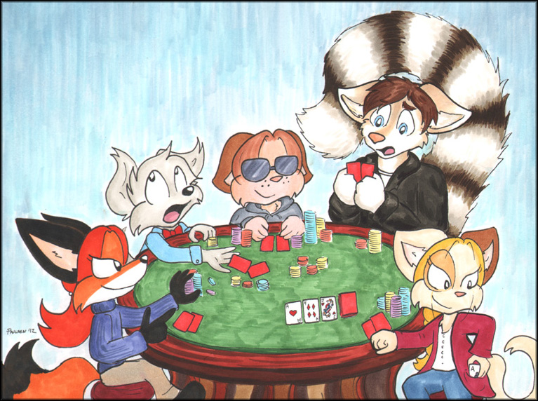
For those who weren't able to spend six hours hanging out with me in the stream, here's the finished version of the piece I colored tonight. The Precocious kids are hustling poor Kendall, and he's about to go down to Autumn's all-in! (Or maybe cheating Tiffany will knock him out first.)
Pieces this complex are pretty intimidating for me, since I still consider myself a newbie with marker, but I'm happy with how it came out.
11x8.5" piece, Copic multiliners and sketch markers on Canson comic paper. This image has approximately half an inch around each edge cropped to show how it would look framed. (No one asked, but I want to prove that I did take possible framing into consideration when I composed the piece.) You can find the full image in my FA gallery.
Kendall belongs to SirKain.
Labels:
Autumn Pingo,
Bud Oven,
cards,
commissions,
Jacob Linkletter,
markers,
streaming,
Tiffany Et
Tuesday, November 27, 2012
Kendall's card trouble
UPDATE: The coloring of this piece was pushed to next week, because the client got sick. Check Precocious' front page for an announcement of when the stream will happen.
I have absolutely no idea how I pulled it off, but I did it! I got the inks done! I can color this tonight as planned! If you want a full explanation of what's going on, you'll have to come to tonight's stream at 7pm Eastern time. I'll be starting with a badge, then moving on to this piece.
And now I rest my hand as much as I can before 7pm.
Also, this is my 999th blog post. That's kinda cool.
Labels:
Autumn Pingo,
Bud Oven,
commissions,
inks,
Jacob Linkletter,
streaming,
Tiffany Et
Sunday, August 19, 2012
Chrispy has left the building
I have returned from FA:United a day early. While I met many wonderful people and had some great conversations, foot traffic in the dealer's room was dreadful and sales were brutal. We decided to cut our losses and bail, and we definitely were not the only dealers to do so. Oh well, a lesson is learned.
...and much good did come from this journey! The artist edition book sketches are done, and mailing begins on Monday! Yay! It was so much fun doing all these sketches, and I hope all who get them enjoy them! For those who are jealous, start making plans to visit me at Intervention and/or Midwest FurFest! You can purchase an artist edition at the table, or bring your copy and get me to upgrade it to superawesomecool!
I'll try to give you another update on how moving/buffering/whatever is progressing next week. Because of the chaos, there will not be a Copper Road on Monday. Sorry! (Vote for me anyway, because I need to feel loved!) The week after will be filled with lots of bonus guest art and comics incentives though!
Labels:
Autumn Pingo,
Bud Oven,
cons,
fail,
frontpage,
Jacob Linkletter,
sketches,
the book
Thursday, June 28, 2012
My Copic'd Kids
My vacation is over! I am back in Savannah and preparing for some major summer undertakings! There's so much to do, and so much planning needed before I can start doing it. It's daunting, but also exciting. (I'll share more about the plans when everything starts to take form.)
While I had a wonderful time stomping around the country and kicking butt all through June, it is nice to be back to the grind. One perk: I HAVE ACCESS TO MY SCANNERS AGAIN! Well then, let's use 'em!
I present to you, the main four Precocious kids in Copic marker, for the first time ever.
The marker thing was a whim that has turned into a wallet-draining tornado. I loved working on grayscale, since it was nice and cost-effective, but the people wanted color and a timely coupon to Art Supply Warehouse resulted in an impulse buy of a color set. And some extra colors. And then some MORE singles to fill out my palette a bit...
Ok, so now I see the appeal. Copics are kinda swell. I have a long way to go before I become a master at them like Darc or Becca, but I really love the practice!
Without a swatch list of my own, I had to guess which colors would fit the Precocious cast best when ordering. Overall, I'm quite pleased with what I could do with my meager collection. (For the record, both Bud and Tiff's fur colors didn't scan well, so I tried to approximate them using Photoshop. They look better in person.)
If you're interested, and you don't feel like reading the info in the pic, here is what I came up with:
Bud:
Fur: Silk
Ears: Baked Clay
Hair: Light Suntan
Nose: Tea Rose
Inner ear: Pinkish White
Pants: Light Grayish Cobalt
Tiffany:
Fur: Egg Shell
Ear: Baked Clay
Hair/Smiley: Cadmium Yellow
Nose: Tea Rose
Inner ear: Pinkish White
Eyering: Yellowish Beige
Dress: Lime Green
Autumn:
Fur: Apricot
Hair: Vermilion
Inner ear: Baby Skin Pink
Dress light: Lime Green
Dress dark: Forest Green
Jacob:
Fur: Warm Grey 3
Shirt: Lipstick Red
Pants: Antwerp Blue
I can see a few colors that might be improved. I may want to play with the orange and yellow in Autumn and Tiff, and Jacob could probably work with Warm Grey 2, but I don't have that one. Jacob's pants could probably be a lighter blue as well. I'm happy with all color choices for Bud. Down the line, I may update the aforementioned colors, but for now I think it's all good. (I can't afford another marker binge for a while.)
While I had a wonderful time stomping around the country and kicking butt all through June, it is nice to be back to the grind. One perk: I HAVE ACCESS TO MY SCANNERS AGAIN! Well then, let's use 'em!
I present to you, the main four Precocious kids in Copic marker, for the first time ever.
The marker thing was a whim that has turned into a wallet-draining tornado. I loved working on grayscale, since it was nice and cost-effective, but the people wanted color and a timely coupon to Art Supply Warehouse resulted in an impulse buy of a color set. And some extra colors. And then some MORE singles to fill out my palette a bit...
Ok, so now I see the appeal. Copics are kinda swell. I have a long way to go before I become a master at them like Darc or Becca, but I really love the practice!
Without a swatch list of my own, I had to guess which colors would fit the Precocious cast best when ordering. Overall, I'm quite pleased with what I could do with my meager collection. (For the record, both Bud and Tiff's fur colors didn't scan well, so I tried to approximate them using Photoshop. They look better in person.)
If you're interested, and you don't feel like reading the info in the pic, here is what I came up with:
Bud:
Fur: Silk
Ears: Baked Clay
Hair: Light Suntan
Nose: Tea Rose
Inner ear: Pinkish White
Pants: Light Grayish Cobalt
Tiffany:
Fur: Egg Shell
Ear: Baked Clay
Hair/Smiley: Cadmium Yellow
Nose: Tea Rose
Inner ear: Pinkish White
Eyering: Yellowish Beige
Dress: Lime Green
Autumn:
Fur: Apricot
Hair: Vermilion
Inner ear: Baby Skin Pink
Dress light: Lime Green
Dress dark: Forest Green
Jacob:
Fur: Warm Grey 3
Shirt: Lipstick Red
Pants: Antwerp Blue
I can see a few colors that might be improved. I may want to play with the orange and yellow in Autumn and Tiff, and Jacob could probably work with Warm Grey 2, but I don't have that one. Jacob's pants could probably be a lighter blue as well. I'm happy with all color choices for Bud. Down the line, I may update the aforementioned colors, but for now I think it's all good. (I can't afford another marker binge for a while.)
Labels:
Autumn Pingo,
Bud Oven,
Jacob Linkletter,
markers,
Tiffany Et,
vivid color
Monday, May 28, 2012
Book sketching tests
The time will soon come when I'll be working on book sketches for the artist editions and those who buy the sketch package at cons. Sweet! Now, how should I handle it?
Every artist handles things differently. I wanted to offer something more than the typical pen and ink approach, so now it's time to find the look. I've seen some wonderful book sketches Darc of Code Name: Hunter did with monochrome colored pencil, so... monkey see, monkey do.
What you see here are various tries to find the best combo of pen and pencil application. Do I sketch in regular pencil, or no-copy blue? Should I erase the pencil or show the process lines? What type of pen should I use for the inking? When should the inking stage occur?
The first try was Tiffany. I began with blue lines, then inked with the glorious Fude pen that was recommended by Becca of Nattosoup. It was all awesome until the coloring began. SMEARS! Noooooo!
Darn it! I want to use that pen whenever possible, so that was disheartening. The next try was Jacob, where I colored him first and use the pen overtop the pencils. That looks great, but it does make coloring more imprecise. It should be OK, though.
Autumn is the standard sketch, using regular tech pens. I erased the pencil after inking, so it's a little cleaner. No problems here, but it's harder to pull off line variance.
Bud's inking went the other way. I left the pencils to show process and used a brush pen, which gives nice lines despite my complete inability to use it. The downside here is that error potential is high, and I take it a bit slower in drawing.
And then there's the blue. I've been on a monochrome kick for a while, so this should be no surprise. It's also practical. It's a lot easier on the logistics to keep it in one color family, and I think it's a nice touch. It doesn't have to be blue. I just like it, and I can use the blue pencil for sketching. (Although it doesn't scan well AT ALL. This is an iPhone photo you see.) There's a chance I could switch to toning with markers, but there's a bleed issue there.
The actual book sketches will be a bit larger, of course. Gotta come up with some scenes to draw, especially since I need to have 21 unique sketches for Autumn. (Yes, that's out of 25 pre-orders. Dang, guys.)
I know I'm getting ahead of myself. Most book sketches won't be happening until August. Still, it's a fun thing to practice!
Wednesday, May 16, 2012
Giving 'em the business
When I went to the post office today to mail the recent commissions, I had a nice chat about the art I was sending with the lady behind the counter. She asked me for a business card, and I checked my wallet. One left! I handed it over and made a mental note to reload when I got back to the apartment. Once there, I pulled out my box to see... I'm in the market to reorder.
The cards I have now will get me through the next con easily, but it'd be wise to reorder before the next. That means updating the design! I like the "I DEMAND ATTENTION!" idea, and those at the cons seemed amused by it too, so it's staying for now. The art for it is quite old at this point, so today I drew a new attention-grabbing Tiffany.
For the design, I made a few changes:
- I removed the Precocious logo from the front, so I could make Tiffany bigger. This may or may not be a good idea.
- Fonts switched around. While I kept the Precocious font for Tiff's voice, everything else was upgraded. The new logo font took over the important info, and a non-offensive Franklin Gothic was used for supporting information.
- The Bud and Autumn on the back were upgraded with the recent magnet images. (Poor Jacob remains shut out.)
- The tagline was rephrased to mention the daily updates, and "webcomic" was changed to "comic" so the label purists won't get mad. (I don't care what you call my strip, as long as you read and enjoy it!)
- Twitter and blog links were added to my information. It gives folks other ways to contact me, and lets them see my personality in action. (Is that good or bad?) The downside is that the back is now text-heavy. I do think the black box for my name did a good job of stabilizing everything.
- I made the blue background cover everything. The original card has a separate white space where the logo and website appeared on both sizes.
I'm liking the upgrade so far, but I'll see what the reaction is before I do any more playing around. Plus, it'd be silly to order new business cards when the company I'd order from botched my magnet order and hasn't come through with the corrections yet. (I was promised it'd happen, but I'll still worry until I see the proofs.)
The cards I have now will get me through the next con easily, but it'd be wise to reorder before the next. That means updating the design! I like the "I DEMAND ATTENTION!" idea, and those at the cons seemed amused by it too, so it's staying for now. The art for it is quite old at this point, so today I drew a new attention-grabbing Tiffany.
For the design, I made a few changes:
- I removed the Precocious logo from the front, so I could make Tiffany bigger. This may or may not be a good idea.
- Fonts switched around. While I kept the Precocious font for Tiff's voice, everything else was upgraded. The new logo font took over the important info, and a non-offensive Franklin Gothic was used for supporting information.
- The Bud and Autumn on the back were upgraded with the recent magnet images. (Poor Jacob remains shut out.)
- The tagline was rephrased to mention the daily updates, and "webcomic" was changed to "comic" so the label purists won't get mad. (I don't care what you call my strip, as long as you read and enjoy it!)
- Twitter and blog links were added to my information. It gives folks other ways to contact me, and lets them see my personality in action. (Is that good or bad?) The downside is that the back is now text-heavy. I do think the black box for my name did a good job of stabilizing everything.
- I made the blue background cover everything. The original card has a separate white space where the logo and website appeared on both sizes.
I'm liking the upgrade so far, but I'll see what the reaction is before I do any more playing around. Plus, it'd be silly to order new business cards when the company I'd order from botched my magnet order and hasn't come through with the corrections yet. (I was promised it'd happen, but I'll still worry until I see the proofs.)
Labels:
attention whoring,
Autumn Pingo,
Bud Oven,
cards,
Merchandising,
Precocious,
Tiffany Et
Sunday, March 11, 2012
The Oven Family Portrait

Here's one of the much-delayed commissions. Thanks to a very timely Skype call, I was conscious for enough hours this evening to get my colored pencil on. Considering how incredibly dizzy I got just by standing up and walking across the apartment to scan this piece, I don't know if I'll get the second commission done tonight. I will try, though!
The scan isn't nearly as nice as the actual piece. A lot of the lighter colors got filtered out by the scanner. (Works great when you're scanning line art. Not so much when you're scanning a soft-colored piece.) I'm pretty happy with how it came out. I wanted to do a fade effect with this (and all the family photos maybe) and I think it came out OK.
Labels:
Bud Oven,
Casey Oven,
colored pencil,
commissions,
Joseph Oven,
Sydney Oven
Thursday, March 8, 2012
Oven Family Portrait
(My third post in three hours! Told you they were coming fast and furious! More to come tomorrow!)

Here's the (proposed) line art for a commission that shall also double as a con portfolio piece.
The task here was to draw family portraits of the main four Precocious clans in happy photo studio style. This is to be a colored pencil piece, if I remember correctly. Up first: The Ovens!

Here's the (proposed) line art for a commission that shall also double as a con portfolio piece.
The task here was to draw family portraits of the main four Precocious clans in happy photo studio style. This is to be a colored pencil piece, if I remember correctly. Up first: The Ovens!
Labels:
Bud Oven,
Casey Oven,
commissions,
drawing,
Joseph Oven,
Sydney Oven
Sunday, February 26, 2012
Some more book art!
I was moving some papers around and I discovered a few bonus drawings I made for the upcoming Precocious book that I'd forgotten to scan. Allow me to share one with you! (I believe this one was a request from the Precocious Facebook group.)In other news, the hand is doing a bit better. I can draw with it now, although not as much as I'd like. Precocious shall continue undisturbed, and Copper Road *should* return on the 1st!
Labels:
Bud Oven,
drawing,
frontpage,
the book,
Tiffany Et
Monday, February 6, 2012
Playing with promo art

Here's a draft for an upcoming Precocious banner, for when I go fully con crazy.
It's about time to start upgrading my online banners too. This is difficult, as I don't have much of a feel for graphic design. I don't know what sells, and I certainly struggle to get my oddly-proportioned characters to fit nicely in any of the standard ad spots. That's sketchbook work for the future, I guess.
Labels:
Autumn Pingo,
Bud Oven,
Jacob Linkletter,
Precocious,
Tiffany Et
Sunday, January 1, 2012
Three years of Precocious!

You heard right! Precocious is THREE YEARS OLD today! Can you believe it? It's been an amazing run so far, and I can't wait to top everything with the awesomeness of this upcoming year!
See that graphic of Bud there? Know what that is? It's one of the bonus illustrations from the first Precocious book! I am packing that thing with as much bonus goodness as possible, so be extremely excited! Stay tuned for further book awesomeness information.
In combination with me starting to get real merchandise, I will also take the next cartoonist step and attend some conventions. My first con experiences will go to the furries, since they seem to like me. I'm schedule to have a table at Furry Weekend Atlanta and Anthrocon. I'll likely be showing up at good old comic cons down the road too, but nothing's been confirmed there yet.
Thank you all for sticking with me though my comic adventure. Let's keep on rocking it into the future!
Labels:
Bud Oven,
cons,
frontpage,
Precocious,
the book
Friday, December 16, 2011
Buy more prints!

This haunting piece of fanart was done by the great Roman Wunderlich of B-Movie Comic, via reader John Cuellar. HOW CAN YOU SAY NO TO THAT FACE?
Monday, November 21, 2011
Saturday, November 19, 2011
Watercolors for you!

The photos aren't that great, but the finals of these commissions are super awesome! Enjoy. The pieces will ship out Monday.

Labels:
Autumn Pingo,
Bud Oven,
commissions,
Tiffany Et,
watercolor
Subscribe to:
Posts (Atom)